
A gray band of smoke can stretch across your whole state on a map while the air monitor a few blocks away reads Good, and both of them can be right. Don't take the colors on a smoke map for granted! One screen often stacks a reading taken at street level in the last hour, a satellite's view from more than 22,000 miles up, and a computer model's best guess about tomorrow.
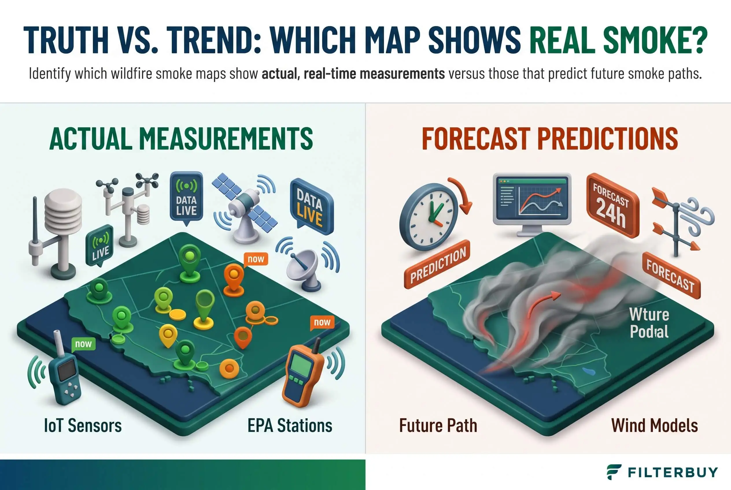
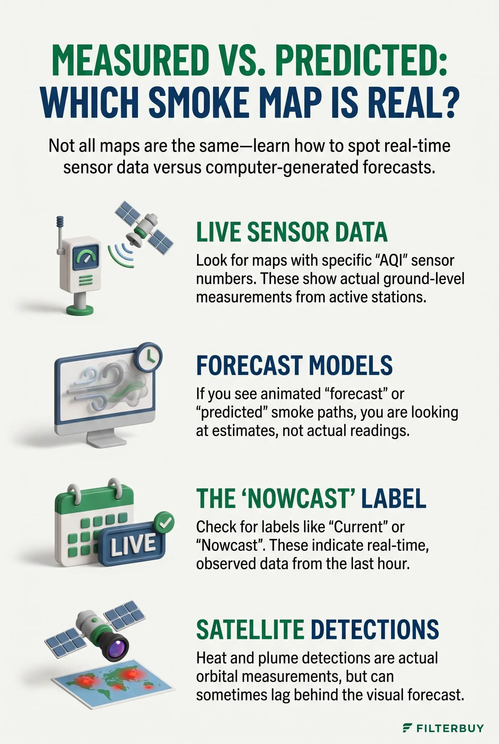
The colored dots on the AirNow Fire and Smoke Map are measurements from monitors and sensors sitting on the ground. Gray shading comes from satellite images, and a satellite can't tell whether that smoke hangs overhead or sits at nose level. Any layer with a slider that moves into future hours is a forecast.
Every hazy morning, I pull up a current wildfire smoke map of the USA today and sort each layer into one of those buckets before I decide anything. It takes less than a minute. And it changes what I do about the air inside my house.
TL;DR Quick Answers
current wildfire smoke map USA today
For a current wildfire smoke map USA today, open the AirNow Fire and Smoke Map and start with the colored dot nearest your home. Those dots are real PM2.5 readings from ground monitors and sensors. Gray plumes show satellite-traced smoke that may sit high overhead, and slider layers are forecasts.
Colored dots: Measured PM2.5 from permanent monitors, temporary smoke monitors, and corrected sensors.
Gray plumes: NOAA satellite tracings of smoke anywhere in the air column, which don’t prove the smoke has reached the ground.
Time sliders: Model forecasts like HRRR-Smoke, best used for planning tomorrow.
Hourly trend: NowCast AQI lags fast-moving smoke, so check whether PM2.5 has climbed for two or three hours straight.
Indoor cue: Once the AQI tops 100, close up, set the fan to On, and run a MERV 8 filter.
Top Takeaways
Dots are measurements: Monitors and corrected sensors report PM2.5 at the level where people breathe.
Plumes are satellite tracings: They show smoke somewhere in the air column, and that smoke may never reach the ground.
Sliders mean forecasts: Model layers project where smoke will go, but they can't see fires that haven't started yet, so treat them as planning tools.
NowCast runs behind: Watch the hourly trend when smoke moves in fast.
The ground reading decides: Once the AQI tops 100, close up, run the fan, and switch to MERV 13.
What Counts as a Real Smoke Measurement on a Map?
A real measurement comes from a physical instrument fixed at one spot and logging PM2.5, the fine particles that make up most wildfire smoke. The EPA and the U.S. Forest Service run the AirNow Fire and Smoke Map, and its ground readings come from these sources:
Permanent monitors: State, local, and tribal air agencies run these regulatory-grade stations. Look for the large circles with numbers.
Temporary monitors: Agencies set these up near active fires, and the map marks each one with a "T" inside a medium circle.
Low-cost sensors: The small blank circles are PurpleAir sensors. The EPA runs their readings through a correction equation so they line up with regulatory monitors during smoke.
You'll only see a reading where an instrument actually sits. The map doesn't fill in the space between dots, so the nearest one could be several miles from your street. If you're using an HVAC ionizer to help manage indoor air quality during wildfire smoke events, remember that outdoor map readings won't tell you how effectively your system is cleaning the air inside your home.
Pro Tip: The AQI on each dot is a NowCast, which weights the last 12 hours of readings. When smoke moves in fast, that number lags behind what's drifting past your windows. Tap the dot and check the hourly PM2.5 trend. If it has climbed for two or three hours straight, act on the trend instead of the headline number.
Why a Gray Smoke Plume Isn't a Ground Reading
Most smoke maps borrow their gray shading from NOAA's Hazard Mapping System. Trained analysts there study visible satellite images, trace every plume they can spot, and grade each one light, medium, or heavy.
Here's something that might surprise you. That shading is a true observation, but it covers the entire column of air. A satellite looks down on the top of the smoke, so a plume riding a mile above your roof and one settling into your neighborhood look the same from orbit.
A 2024 study, listed in the resources below, lined those plumes up against airport observations and EPA monitors. The researchers found that light plumes overstate smoke days, and that outside the West, smoke under a plume often stays aloft.
The 2026 U.S. wildfire season showed both outcomes. In February, the National Fire in Big Cypress National Preserve pushed dense smoke down across South Florida, and officials temporarily closed Alligator Alley. On plenty of other days, a gray band covers a state while every monitor beneath it reads Good.
Which Smoke Maps Are Forecasts?
If a layer lets you slide forward in time, you're looking at a prediction. The main smoke model in the U.S. is NOAA's HRRR-Smoke. It reads the heat that satellites detect from active fires, estimates how much smoke each fire puts out, and feeds that into a high-resolution weather model that projects where the smoke will drift and how thick it'll get near the ground.
Smoke outlooks do the same job in plain English. Air resource advisors write them for large fires to describe likely smoke impacts over the next few days.
Forecasts work well for planning tomorrow's errands. They do have two blind spots. A model can't see a fire that hasn't started yet, and when satellites underestimate how much heat a fire gives off, the model can underpredict how much smoke reaches you.
How to Read a Current Wildfire Smoke Map USA Today in Three Checks
Run any layer on any map through these checks, and you'll know what it's really telling you.
Check Where the Data Came From
Open the legend and look for one of four words: monitor, sensor, satellite, or model. A dot pinned to a location is a ground measurement. A shaded shape is either a satellite tracing or model output.
Check the Timestamp and Averaging Window
Find the last update and how the map averages the number. On the same afternoon, a one-hour reading, a 12-hour NowCast, and a 24-hour average can tell you very different stories.
Check Whether the Layer Is Observed or Forecast
A time slider or a "forecast" label means you're looking at a model. The easiest maps to read give observed smoke from the last 24 hours its own toggle, separate from the 48-hour forecast, and the first map in the resources below works exactly that way. I keep the observed layer on and only flip to the forecast when I'm planning the next day.
What to Do Indoors When the Map and the Sky Disagree
When the plume says smoke and the nearest monitor says Good, go with the monitor and keep watching its hourly trend. Once that reading climbs past 100 into Unhealthy for Sensitive Groups, it's time to protect the air your family breathes inside.
Close up: Shut windows and doors, and set any fresh-air intake to recirculate.
Set the fan to On: Your system keeps pulling air through the filter between heating and cooling cycles.
Upgrade the filter: Run the highest MERV rating your system can handle. For most homes, MERV 13 is the recommended standard for catching fine smoke particles.
Check it afterward: A 1-inch filter can go gray fast during a long smoke stretch, and changing it more often can help with asthma flare-ups.
"On smoky days, I check the satellite plume against the nearest ground monitor before I change anything in the house. The plume shows smoke anywhere from the ground to high in the sky, while the monitor shows what's actually reaching the return grille, so when the two disagree, that monitor's hourly PM2.5 trend tells me whether a MERV 13 goes in that afternoon."
7 Essential Resources
Current Wildfire Smoke Map USA Today: Live fire points and satellite smoke, with observed smoke and the 48-hour forecast on separate toggles, plus steps for protecting indoor air.
AirNow: How To Use the Fire and Smoke Map: The official guide to monitor, temporary monitor, and sensor circles, plus plume settings and smoke outlooks.
NOAA Hazard Mapping System Fire and Smoke Product: The source of the satellite smoke layer, and how analysts build it.
Is the Smoke Aloft? HMS Surface Smoke Study: The 2024 peer-reviewed study that checks satellite plumes against ground readings.
National Significant Wildland Fire Potential Outlook: Monthly and seasonal fire potential forecasts for the United States.
American Lung Association: Wildfire Smoke and Lung Health: Who faces the most risk from smoke, and how to set up a clean room at home.
National Weather Service: Wildfire Weather Safety: How to prepare and act early when fire weather starts to build.
3 Supporting Statistics
The National Interagency Fire Center counted 64,393 U.S. wildfires and 9,032,816 burned acres this year through October 14, 2026. National Interagency Fire Center National Fire News
Asthma-related emergency department visits ran 17% above expected across the 19 days that Canadian wildfire smoke reached the U.S. between April and August 2023. CDC Morbidity and Mortality Weekly Report
People have opened the AirNow Fire and Smoke Map more than 24 million times since it launched in 2020. EPA Science Matters
With more than 64,000 U.S. wildfires recorded in 2026, a 17% increase in asthma-related emergency visits during major smoke events in 2023, and over 24 million visits to the AirNow Fire and Smoke Map since 2020, staying informed about wildfire smoke and air quality is essential. Checking reliable smoke maps and using top filters designed to capture fine airborne particles can help protect indoor air quality when wildfire smoke reaches your area.
Final Thoughts and Opinion
My honest take is that most smoke-map confusion comes from expecting every layer to answer the same question. Dots show what you're breathing. Plumes show what's overhead, and forecasts show what might roll in next.
Base your health decisions on the closest ground reading and its hourly trend. Save the plume and the forecast for the bigger calls, like whether to stock up on filters or move tomorrow's plans indoors. That one habit turns a confusing map into a quick daily routine. It also keeps you a step ahead of the smoke. Having a pleated furnace filter with a suitable MERV rating ready can help capture fine smoke particles when outdoor air quality worsens.
Frequently Asked Questions
What Is the Most Accurate Current Wildfire Smoke Map USA Today?
For what's in the air right now, use a map built on ground monitors and corrected sensors, like the AirNow Fire and Smoke Map. Pair it with a map that labels observed and forecast smoke separately, so you always know which layer you're reading.
Why Does PurpleAir Show Different Numbers Than AirNow?
AirNow averages sensor data by the hour, runs it through the EPA correction equation, and reports a NowCast AQI. The PurpleAir map can show raw or shorter-interval readings, so the two often split apart when smoke changes quickly.
Does Gray Smoke on a Map Mean I'm Breathing Smoke?
Not always. Satellite plumes include smoke high in the atmosphere, so check the nearest ground monitor to see whether any of it has reached the surface.
How Accurate Are Wildfire Smoke Forecasts?
They do a good job showing where smoke will likely drift. They can underpredict when satellites underestimate a fire's heat, though, and they can't account for fires that haven't started.
How Often Do Smoke Maps Update?
Ground monitors report every hour. Analysts post satellite plume updates a few times a day, and forecast models run on their own schedules, so check the timestamp on every layer.
Should I Change My Furnace Filter After a Smoke Event?
Pull it out and look right away. If the media looks gray or matted, replace it. A loaded filter restricts airflow and catches less of the next round of smoke. Since different types of air filters offer varying levels of particle filtration, choose one with a suitable MERV rating to help capture fine particles from wildfire smoke.
Trust the Smoke Reading Closest to Home
The maps that show actual measurements are the ones with readings pinned to the ground, so start each smoky day with the dot nearest your home. You're the one keeping your family's air clean, and that single reading tells you when to close up, run the fan, and let your filter do its job. These simple steps can help keep wildfire smoke out of your home and protect your indoor air quality.